
Halloween t-shirts from Lonely Kids Club, the independent Sydney label, are the subject of this guest feature by its founder, Warwick Levy. He picks four spooky graphic tees from the label’s Halloween collection, by Arcane Bullshit, Claire Harrison and Eduardo Ely, and looks at what each artist does with familiar horror imagery. There is a coven that sounds like a group chat, a skull with a very unhelpful daily planner, a bright red cryptid with a motto, and a skeleton enjoying a good book. Along the way he makes a case for artist credits, for colour in spooky art, and for looking past the thumbnail. Over to Warwick.
A skull can look deadly serious until you set it beside a line about hotdogs. Then you look again, and that second look is where the fun lives. The best spooky tees give the joke something real to interrupt: a drawn world, a credited artist, and details worth seeing up close.
A skull can look extremely serious until you put it next to a sentence about eating hotdogs. Then you have to look at it again. That second look is where a lot of the fun happens. You recognise the bones, the witches or the ominous lettering, then realise the artwork has something much sillier going on.
I run Lonely Kids Club, an independent clothing label in Sydney. We launched in 2011 and still print our tees to order ourselves. Our Halloween t-shirts collection brings together different artists working with that familiar spooky imagery. Four designs give a pretty good idea of how much room there is to play with it, from a chatty coven to a skeleton getting stuck into a book.
Moon Wives and the extremely casual coven
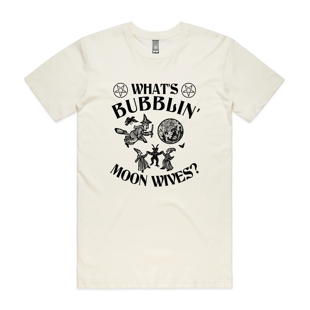
Our collaboration with Arcane Bullshit is a good place to start. The project’s vintage style illustrations have the look of something you might find in a strange old book. The wording tends to suggest whoever wrote the book was taking the piss. You get enough detail to enjoy the drawing before the caption sends it somewhere else.
Moon Wives has witches, a broomstick and a large moon, with the greeting “What’s bubblin’, moon wives?” across the design. The witches look busy. There’s a little gathering happening under the moon. Then the greeting makes the whole thing feel like someone checking in on the group chat. You can almost hear someone asking who’s bringing snacks.
The joke works because the illustration gives it something to interrupt. If you reduced it to the words alone, you’d lose the little world around them. Keeping the artwork credited to Arcane Bullshit matters for the same reason. The drawing and the wording belong together, and that particular combination is the artist’s work.
Think About Death has checked your calendar
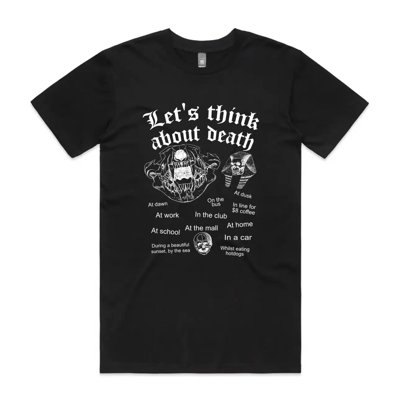
Another Arcane Bullshit design, Think About Death, takes a fairly enormous subject and gives it a list of convenient opportunities. There are skulls and heavy Gothic lettering above suggestions that include work, the bus and waiting for an eight-dollar coffee. Apparently there’s plenty of room for contemplating mortality in an ordinary day.
The tiny line about eating hotdogs is especially ridiculous beside all those teeth and eye sockets. The design keeps moving between the big scary thing and the small everyday thing. You look at a skull, read another suggestion, then go back to the skull. It has enough going on to reward that closer look.
That’s useful to think about with any graphic tee. The image needs to make sense from a little distance, but details can give you a reason to keep looking. Here, the big lettering catches your eye first. The smaller text is where the joke keeps going. It’s basically a very unhelpful daily planner.
Be The Cryptid puts the creature in charge
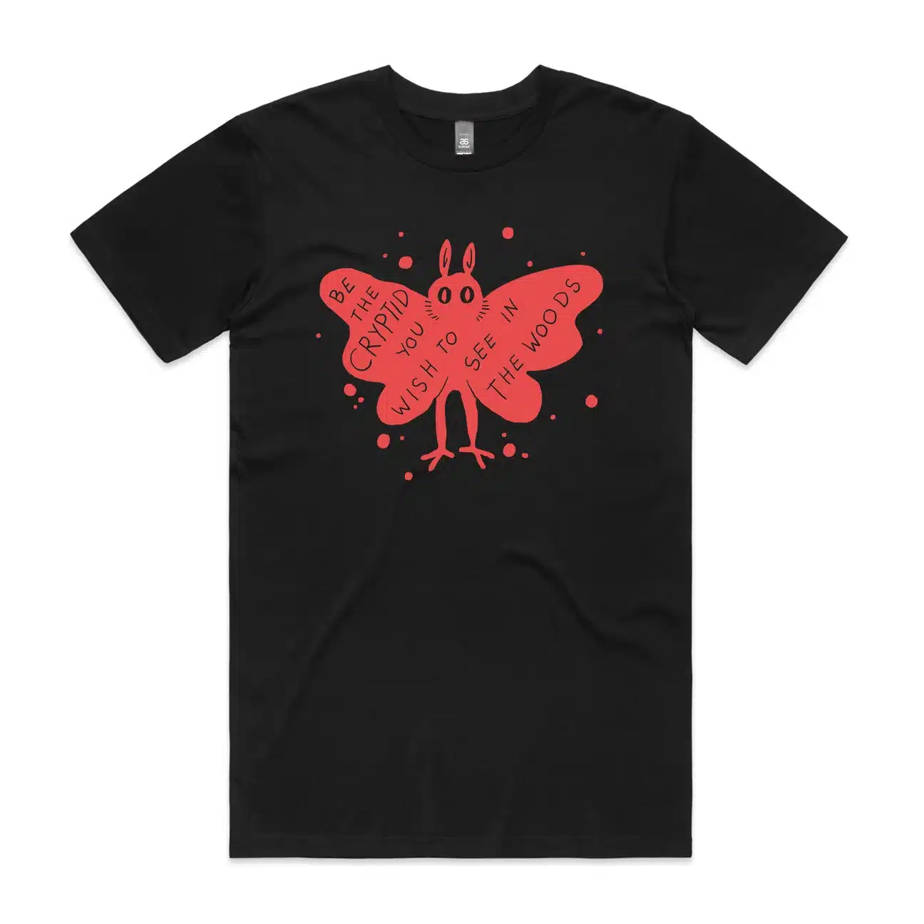
Claire Harrison’s Be The Cryptid takes a different approach. A bright red, winged little creature carries the words:
It has big eyes and spindly legs, with the lettering sitting inside its wings. There’s something quite cheerful about it for a creature you’re supposedly finding in the woods.
The drawing gives the creature a personality before you’ve even finished reading. It looks ready to go somewhere. The wording lets you imagine being the thing someone else spots between the trees, which is a funny little reversal if you’re used to stories told by the frightened person with the torch.
It’s also a reminder that spooky artwork can use colour. That red creature stands out clearly against black without needing extra decoration around it. A strong shape can do a lot. You don’t need to cram a whole haunted forest onto someone’s chest to get the idea across.
The Reader has all the time in the world
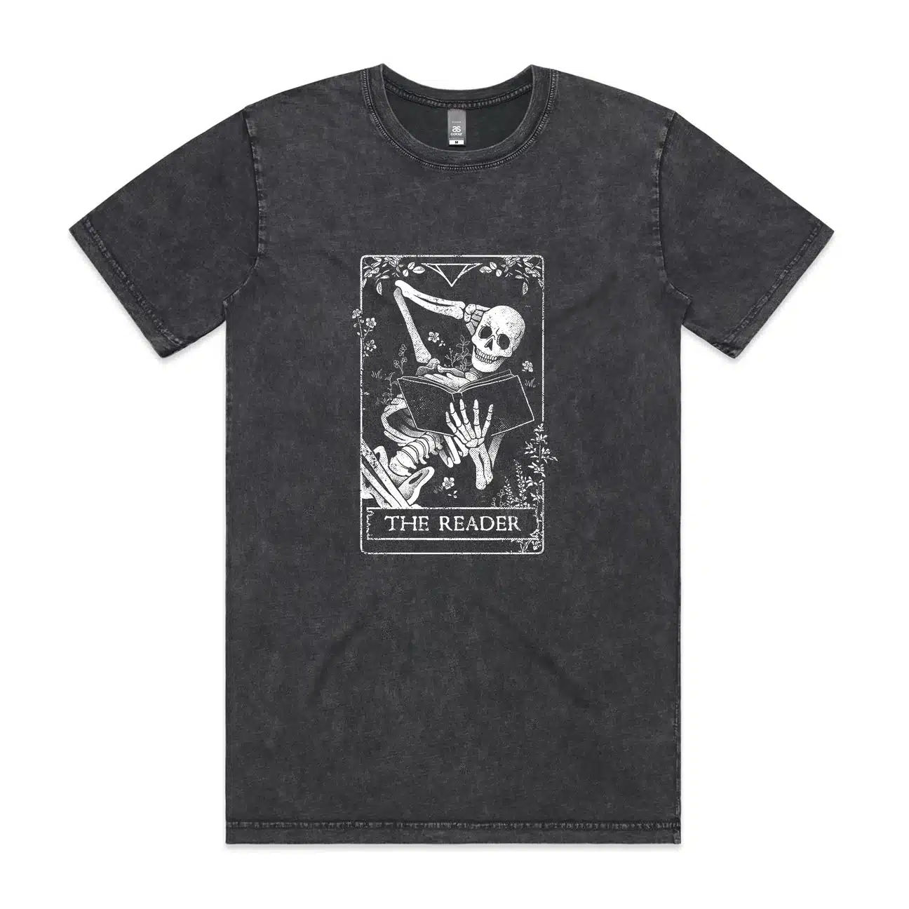
Eduardo Ely’s The Reader has a skeleton holding an open book, one arm resting behind its head. Flowers and little plants surround it inside a frame that gives the design the feel of a tarot card. The bones are there in plenty of detail, but the pose is wonderfully relaxed.
There’s no big gag written across this one. The skeleton is just reading. For anyone whose idea of a decent evening involves a book and being left alone, the scene is easy to recognise. Being dead appears to have cleared a few things from the calendar. Finally, a chance to catch up.
The fine lines and the border make this worth seeing as an artwork as well as on a shirt. That’s why we’ve included both sorts of image with this piece. A tee photo shows how a design sits on a body. The artwork lets you look properly at the small details that can disappear in a thumbnail.
Printing the weird stuff
There’s a practical reason we can keep a mix like this around. We print after someone orders, rather than making piles of each finished design in advance. A witches’ greeting and a reading skeleton can sit alongside each other without us having to guess how many of every size people will want.
For someone choosing a tee, it’s worth looking closely at the actual drawing and checking the artist credit. A skull on its own tells you very little about the design. The expression, the pose or one daft sentence can tell you much more. Open the artwork image if there’s one available, then look at the garment photo and the measurements.
Halloween is also a useful excuse to pay attention to artists you might not have come across before. If a drawing grabs you, following the person who made it is a decent next step. Looking at a few pieces together helps you spot what belongs to their style: the way they draw a face, handle lettering or use empty space. Those differences are easy to miss when you’re flicking through a page of tiny product photos.
All four of these use familiar spooky subjects, but the characters are doing very different things. That leaves room for people who want their horror funny, quiet or a bit odd. And if your shirt encourages you to think about death on the bus, you can still get off at your usual stop. You’ve probably got things to do.
Jim "The Don" McLeod has been reading horror for over 35 years and reviewing it for more than 16. He's the editor of Ginger Nuts of Horror, Europe's largest independent horror review and culture site, and a British Fantasy Award nominee for his work in the genre. When he's not busy inflicting his opinions on the horror community, he can be found annoying his family or getting thoroughly outwitted by his two dogs, Casper and Molly.
Ginger Nuts of Horror: The Heart and Soul of Horror Reviews


